🧐 Problem Space
The COVID-19 pandemic forced many parents to work from home (WFH), creating new challenges in balancing work and parenting. A national survey found that 1 in 4 parents (25%) reported a decline in their mental health. This increased stress often contributes to more frequent conflicts between parents and children.
👩🏻 Research: User Interviews
We interviewed 5 fathers and 9 mothers working from home during the pandemic. Their stories revealed recurring challenges in balancing professional and parenting responsibilities.
Common Pain Points
- Frequent interruptions during work, making it hard to stay focused and professional
- Guilt about using screens as a distraction
- Difficulty transitioning between work and parenting roles, often leading to burnout
🧑🏻🏫 Research: Expert Interview
To deepen our understanding, we also spoke with 3 experts:
- A teaching assistant at the Carnegie Mellon University Children’s School
- A therapist from Carnegie Mellon’s Counseling and Psychological Services (CaPS)
- A pediatrician based in New York

👤 Target User
Based on our research, we targeted WFH parents with children aged 2 to 6. Children under 2 have demanding physiological needs, while after age 6, many parents described their kids as more socially independent and less interested in parent interaction.
With this in mind, we framed our challenge as: How might we help WFH parents achieve a balance between parenting and working?
🔁 Concept Development & Iteration
Ground in our research findings, we explored two early directions that addressed the key challenges faced by working parents. After presenting both ideas to parents, we decided to move forward with the Collaborative Art Platform.
This led us to refine our design prompt: How might we reduce children’s screen time while helping parents strengthen their bond with their children?
By focusing on creativity, independence, and emotional connection, this direction directly addressed the two most consistent pain points we heard: guilt around screen use and the emotional fatigue of switching between work and parenting.
✍🏻 Early Sketches & Information Architecture
To support this new direction, we began sketching the core structure of the app. The initial information architecture included:
- A Home Page for personalized content
- A Search Page to explore child-friendly activities
- A Community Page for sharing and inspiration
- A Favorites Page to save and revisit content
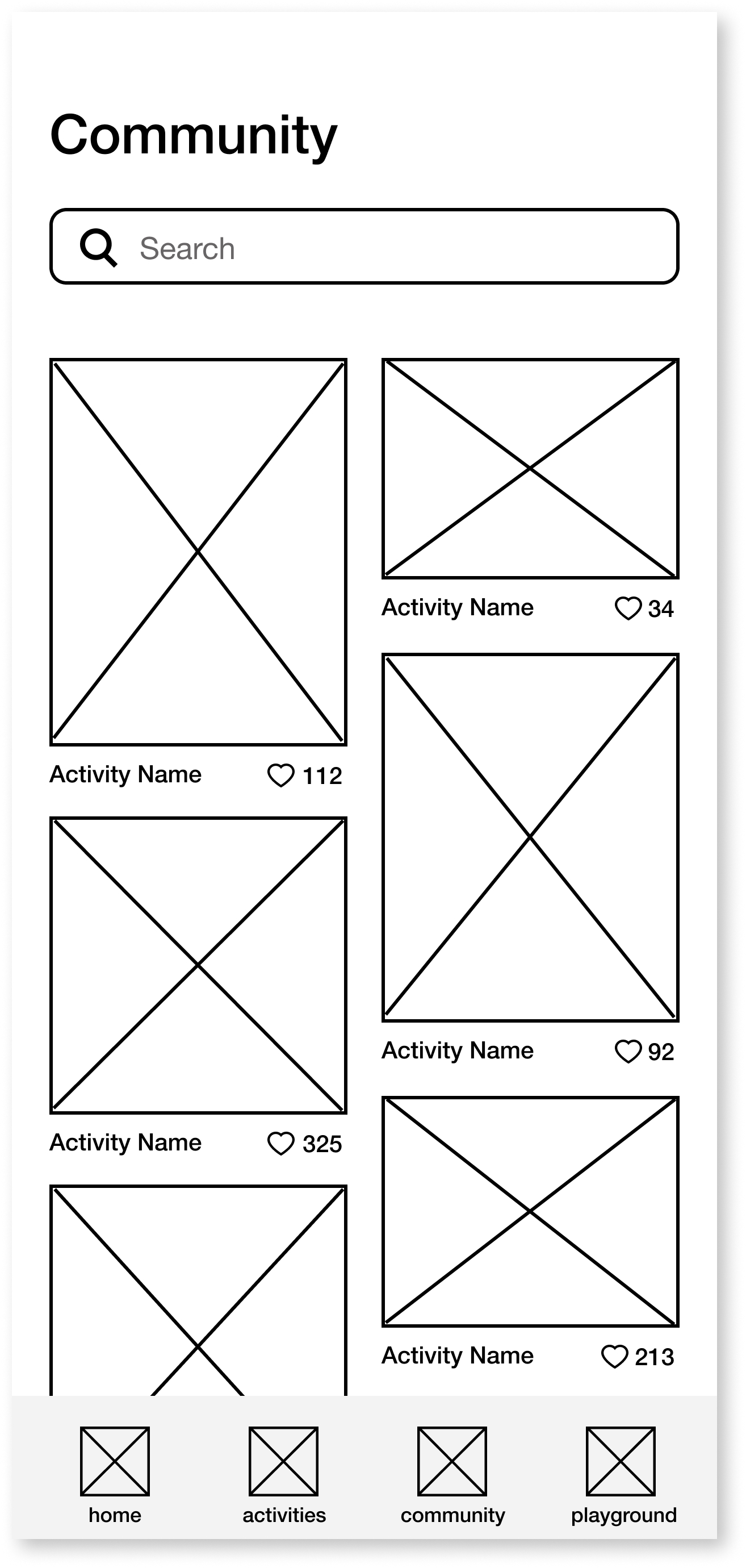
With this structure in place, each team member took responsibility for sketching one section of the app. I focused on the “Find Activities” section, exploring how users might discover relevant, engaging content efficiently. Below are some of our preliminary sketches:
👩🏻💻 User Testing
We conducted 2 rounds of usability testing with 7 participants, using scenario-based tasks and a think-aloud protocol to uncover friction points and gather real-time feedback. Each round focused on a different area of the experience, leading to three key refinements:
Community Sharing → Idea Sharing
Originally, the community page allowed parents to share photos of their children’s completed activities. However, users raised concerns about privacy. In response, we shifted the focus to sharing activity ideas instead, promoting inspiration and collaboration while respecting personal boundaries.

Filter Improvements
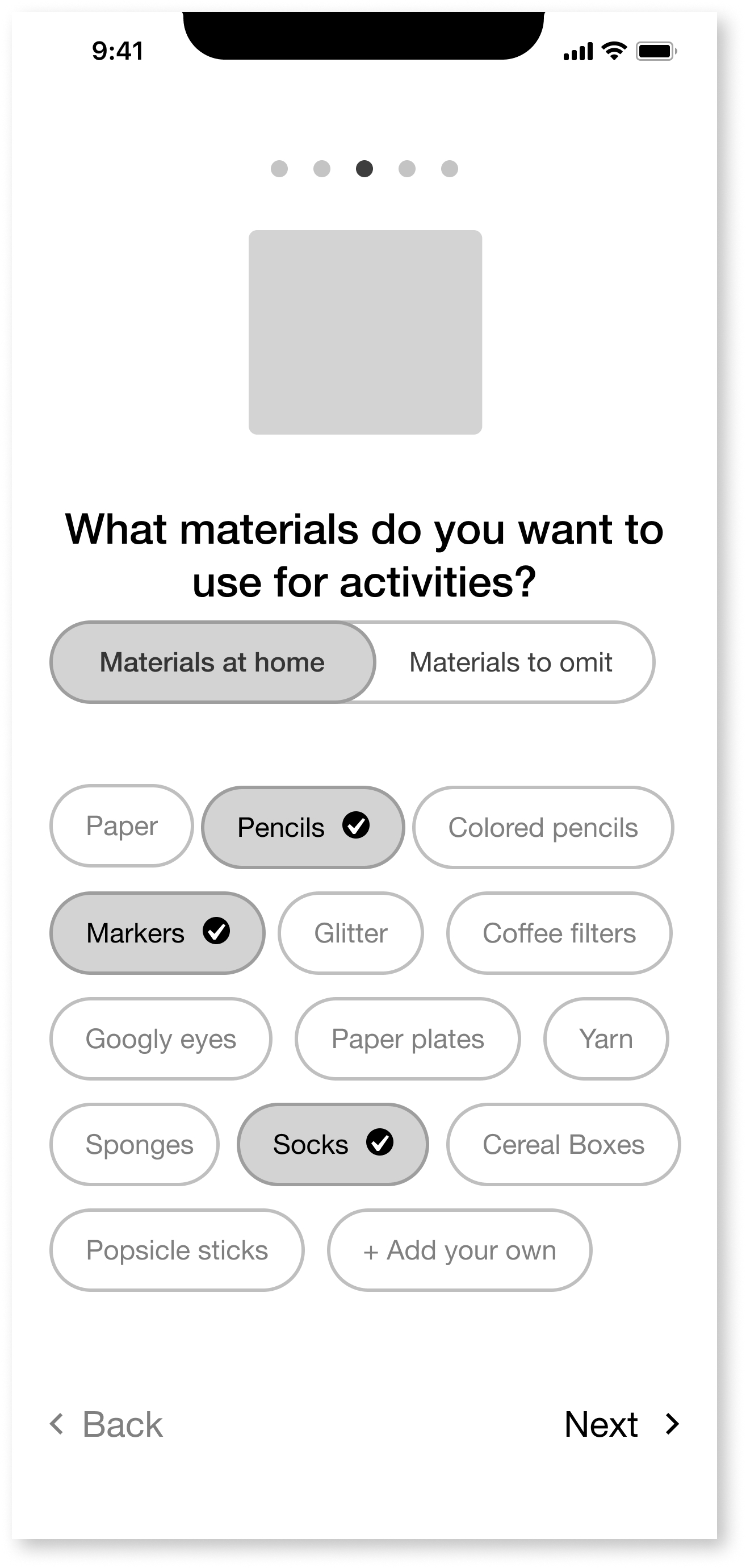
The original filtering interface was unintuitive and time-consuming. We simplified the design and introduced smart defaults based on onboarding preferences (e.g., activity duration, number of children), making discovery faster and more relevant.


Material Preferences
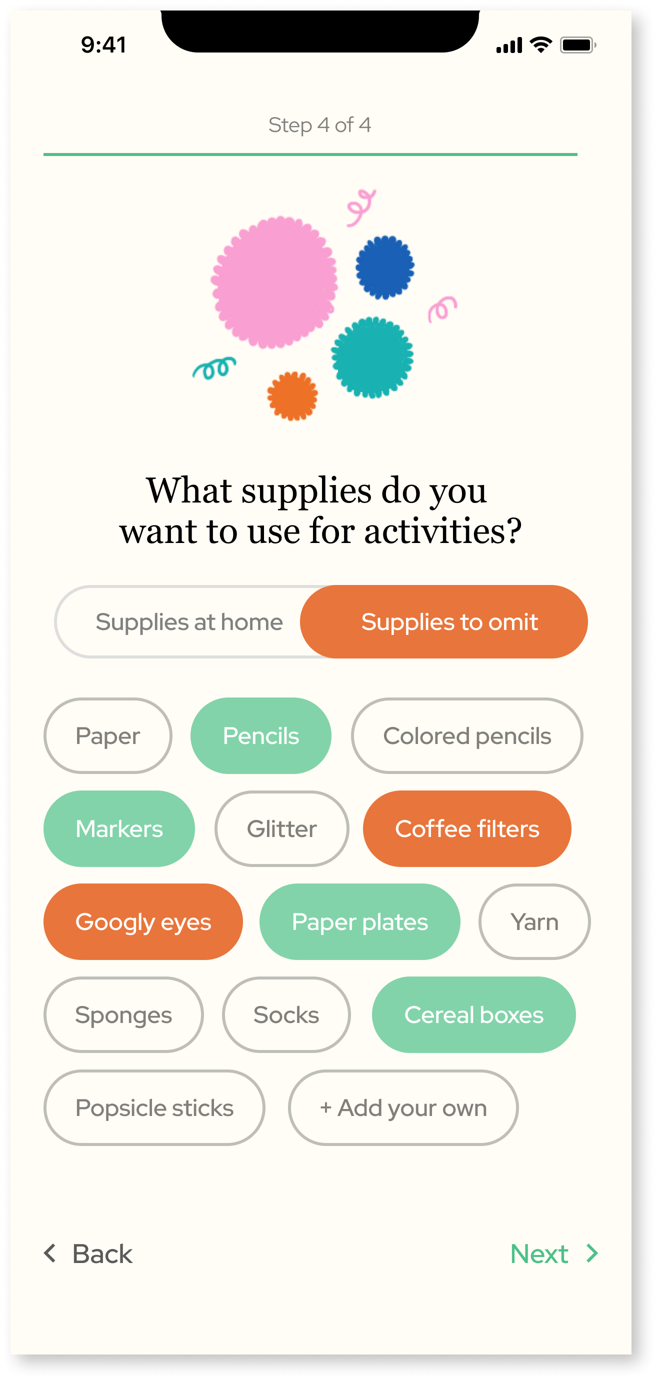
Users found managing supplies across two separate pages confusing. We merged “Materials at Home” and “Materials to Omit” into a single, streamlined interface, allowing parents to quickly tailor activity recommendations to their available resources.

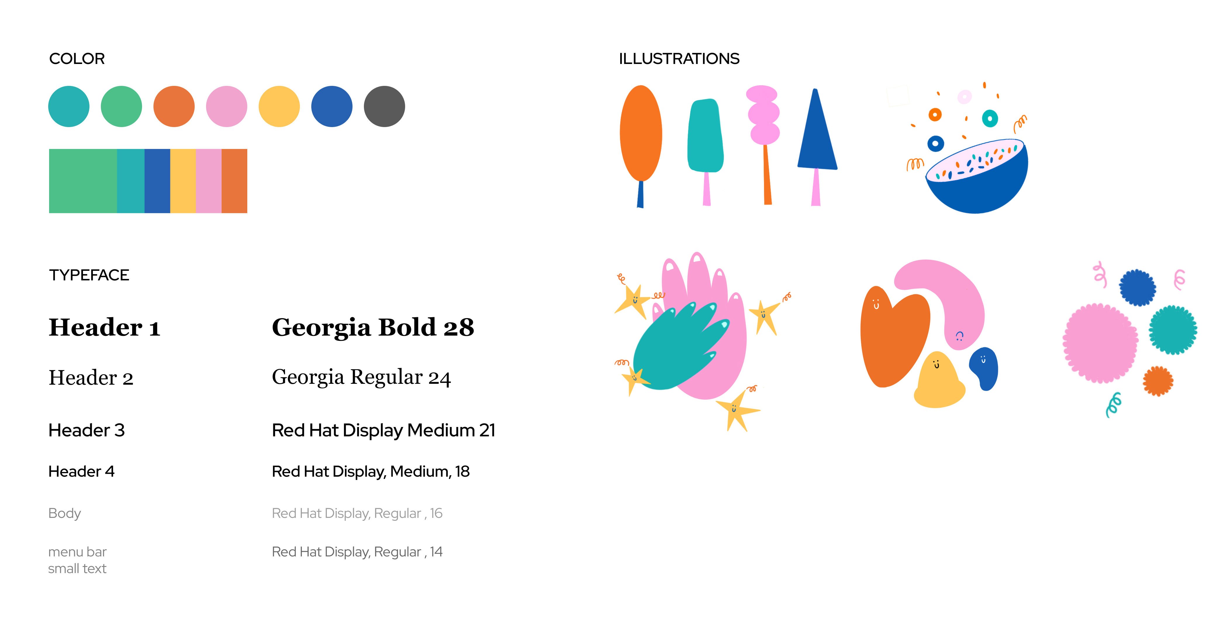
🎨 UI & Branding
To attract and satisfy both parents and children, the UI need to be simple, clear, and quick to navigate, while also conveying a delightful and playful mood. The design balances ease of use for busy parents with a tone that feels welcoming and fun.
For our primary brand color, we chose green, inspired by the name Polliwog—another word for tadpole. This not only tied back to our brand metaphor but also helped reinforce a sense of playfulness and boldness.
✅ Final Designs
Onboarding
Explore
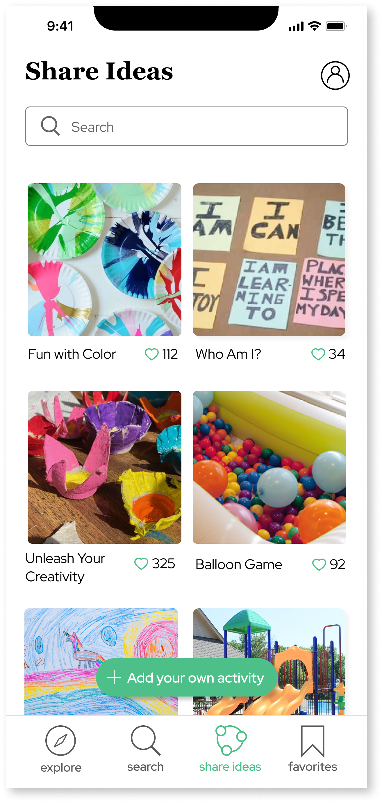
Share Ideas
The Share Ideas feature allows parents to share their own activity ideas, helping to build a supportive, collaborative community centered around creativity and shared experiences.