00. Timeline
WHAT HAPPENED WITHIN 6 MONTHS?
For brand development, the timeline was organized into three stages: Recruitment, Promotion, and ‘Day-of-Show.’ Around December, the teams were split into smaller task groups: Posters, Merch and Booklet. I was in the Posters task group and was in charge of the Merch group.

01. LG Recruitment/Promotion of Organization
THESE ASSETS WERE DESIGNED WITH LUNAR GALA’S PREEXISTING BRANDING AND STYLE GUIDELINES.
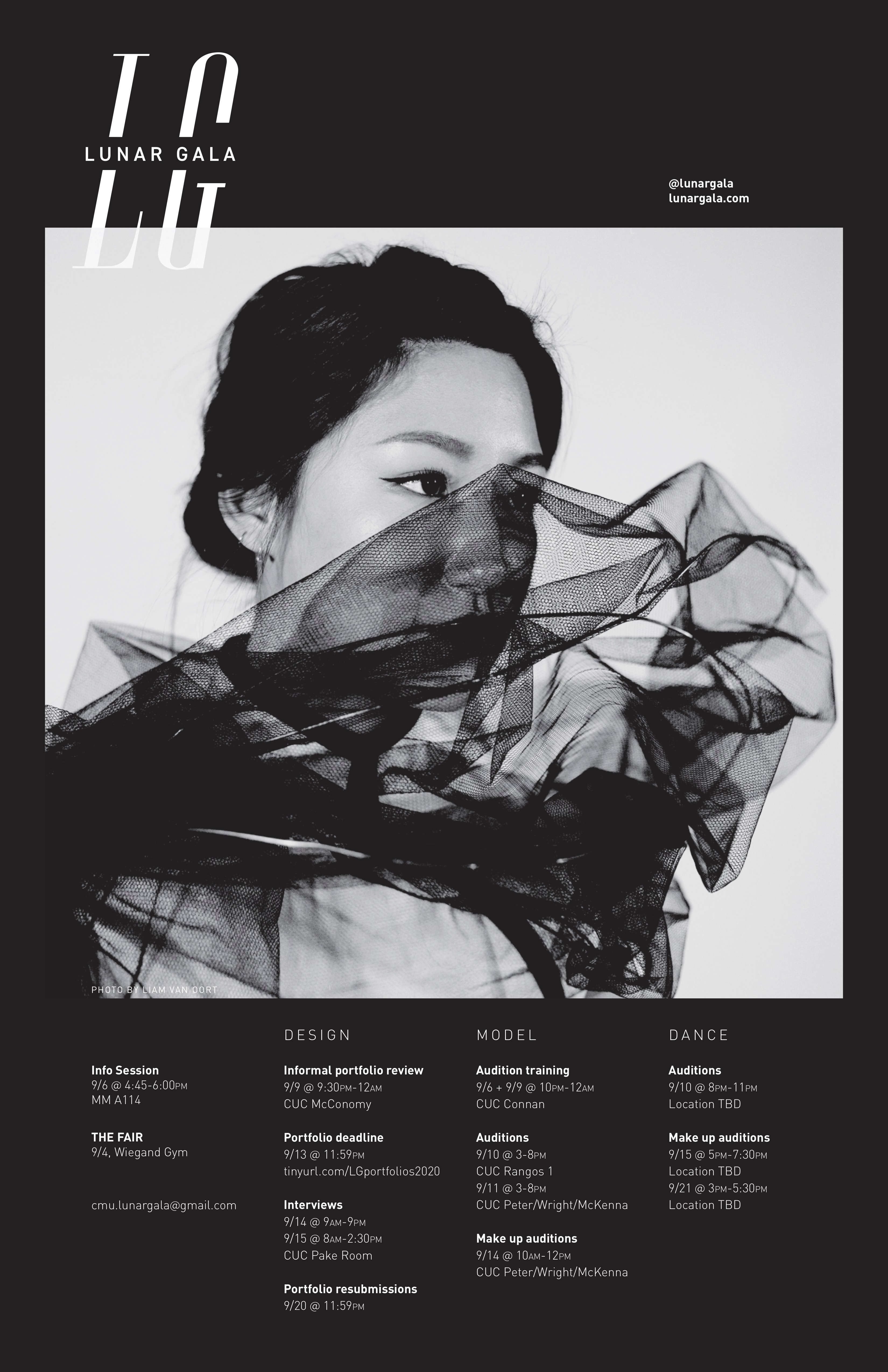
Because I was abroad from September to December, I couldn’t take part in designing and producing the business cards and sponsorship packages; therefore, I focused on designing the Interest Poster and helped develop & finalize the visual identity of the 2020 LG theme Yesterday.
02. Visual Identity
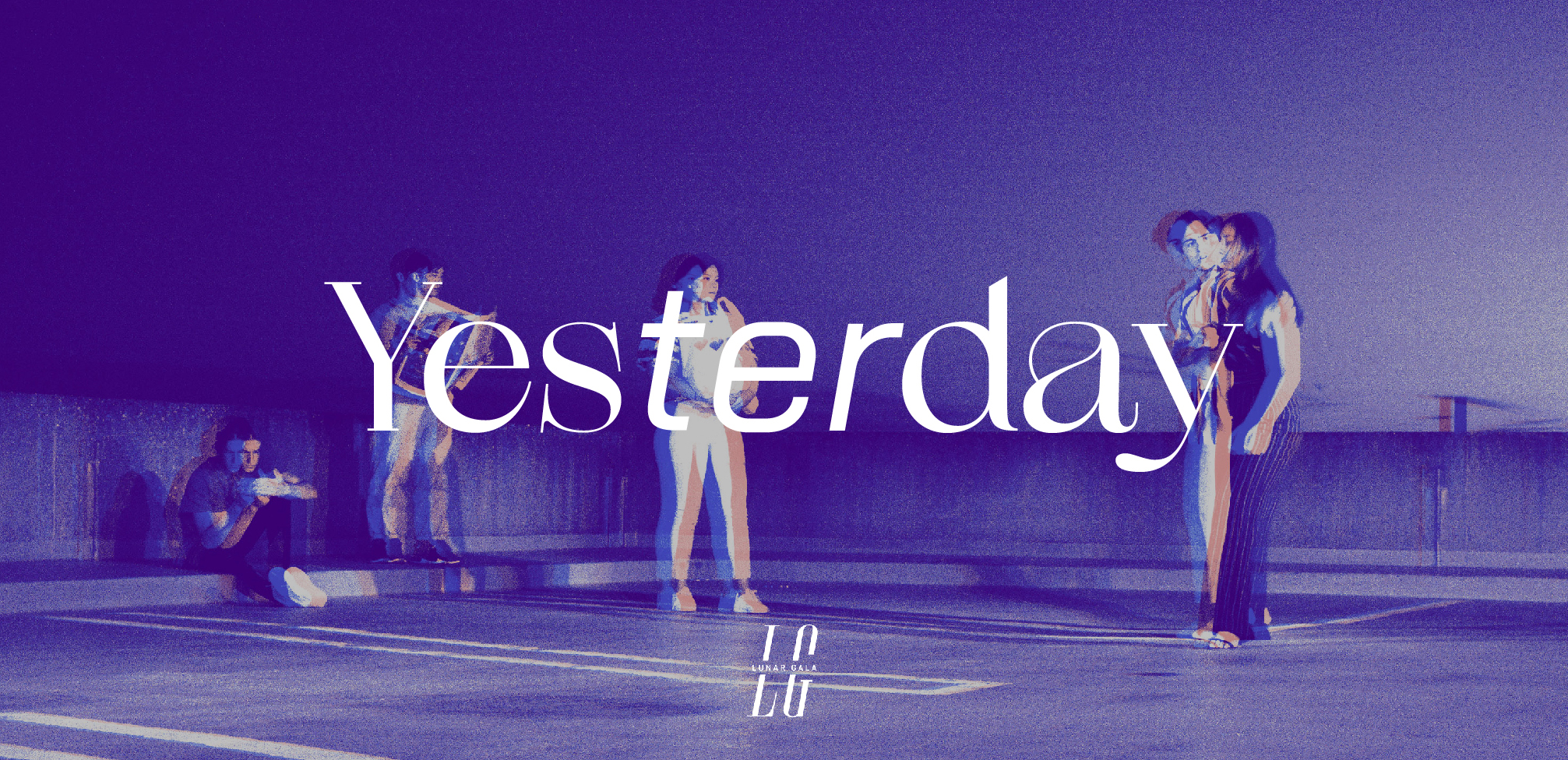
“YESTERDAY EXISTS AS A LIMINAL SPACE IN TENSION BETWEEN PAST AND FUTURE. DOES OUR DISTORTED MEMORY OF THE PAST ALTER THE EVENTS OF THE PRESENT?”
Yesterday celebrates the dynamic changes the Steel City has undergone throughout history. It explores the tension of what happened yesterday and what could happen tomorrow. As students and as a community, we are undergoing a period of change that leaves us with conflicting feelings of nostalgia, apprehension, and hope. This year’s show invites viewers of the Pittsburgh community to explore what “change” has meant to them and how this affects our vision of the future.
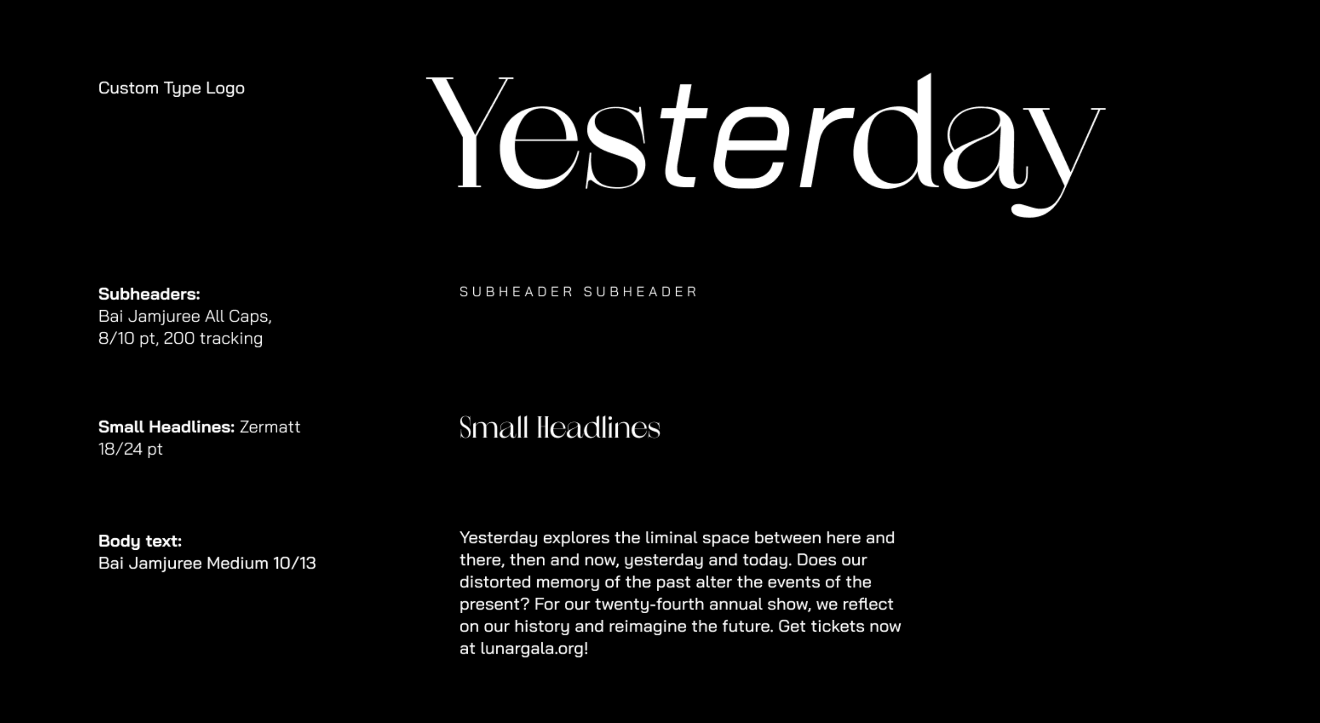
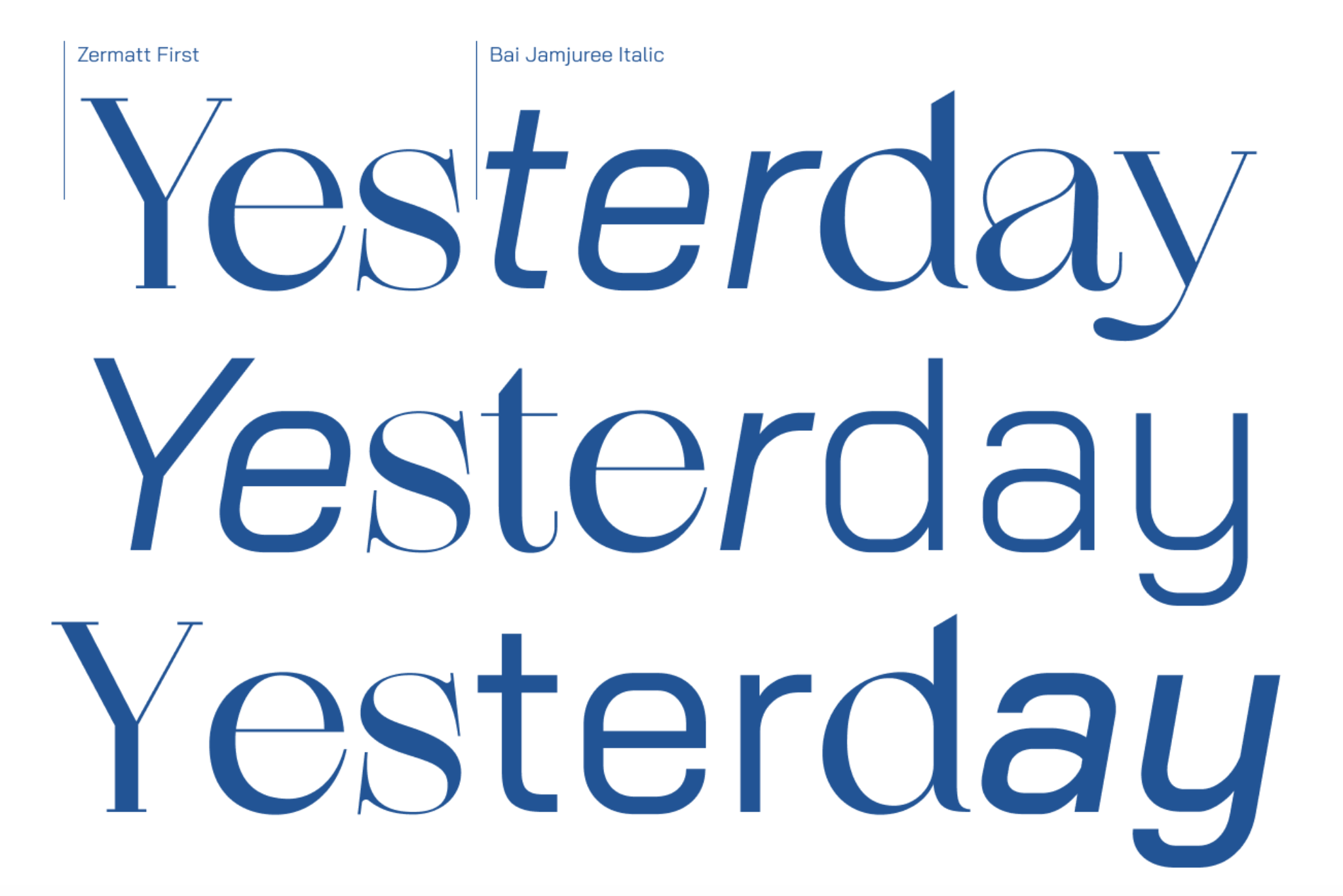
This year‘s theme branding fell heavily on typography. To communicate the message of Yesterday and its shifting, liminal quality, we combined two complementing typefaces in the same line. We used the stylized serif Zermatt and mixed it with Bai Jamjuree, a very square & modern sans serif.
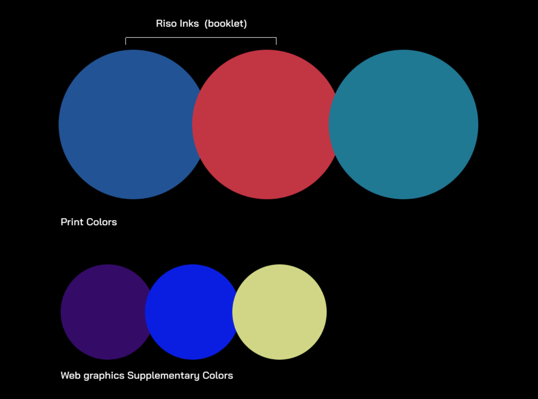
Color treatment was based primarily around available risograph inks, which then informed the palette for non-riso assets.
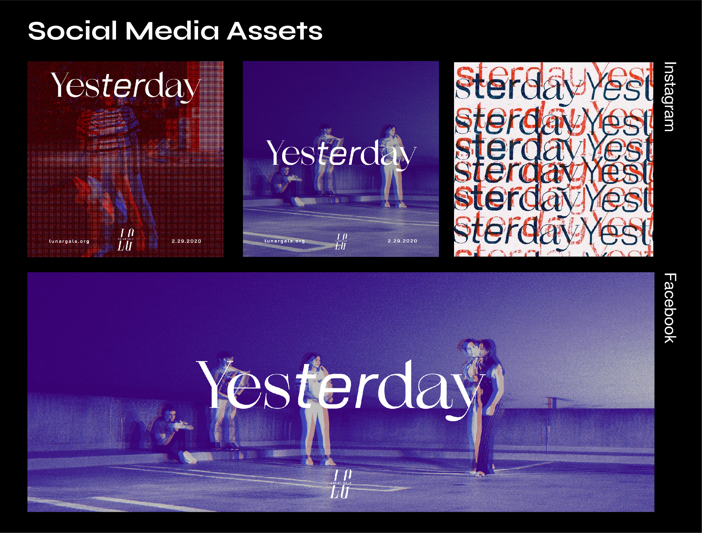
03. Promotion
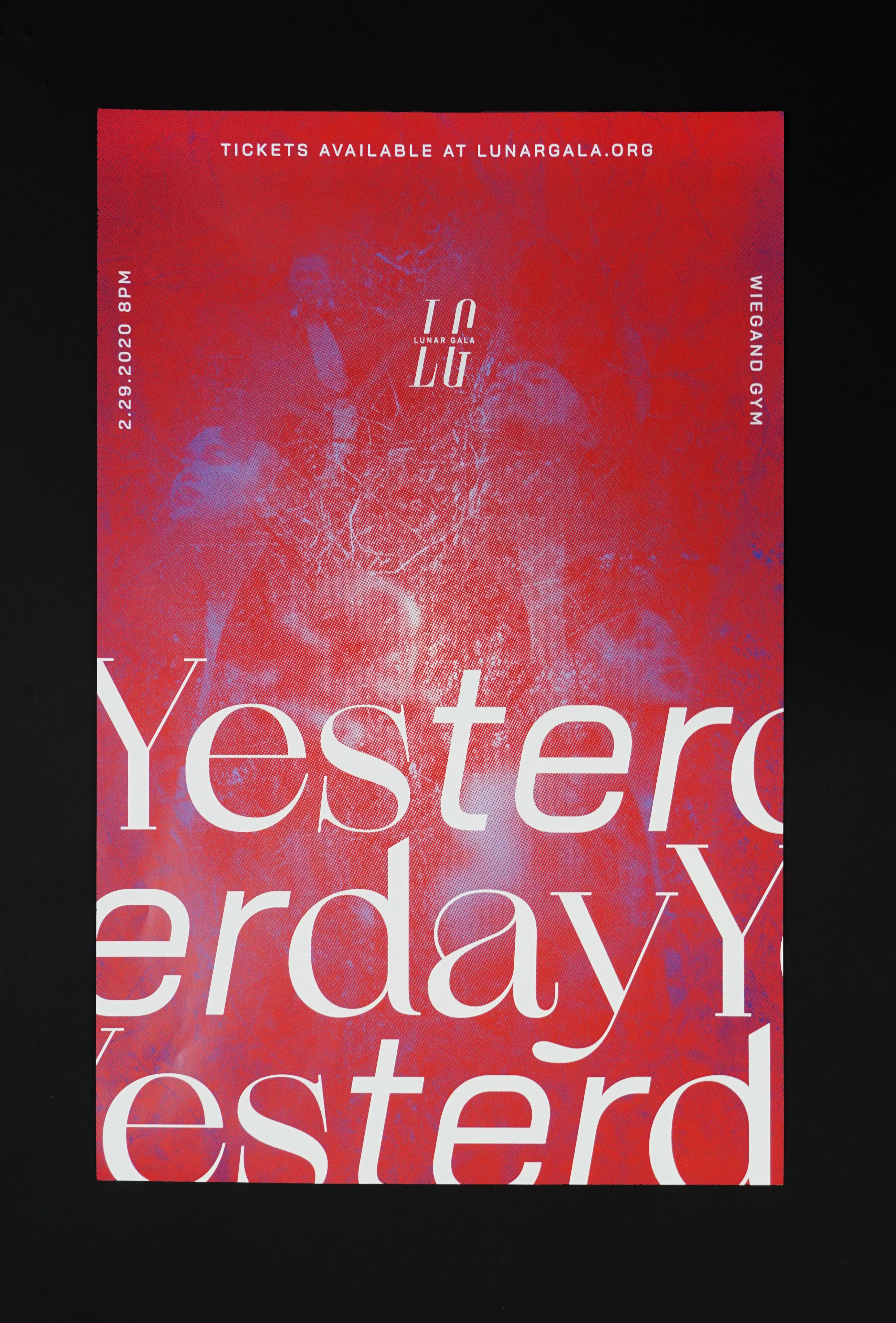
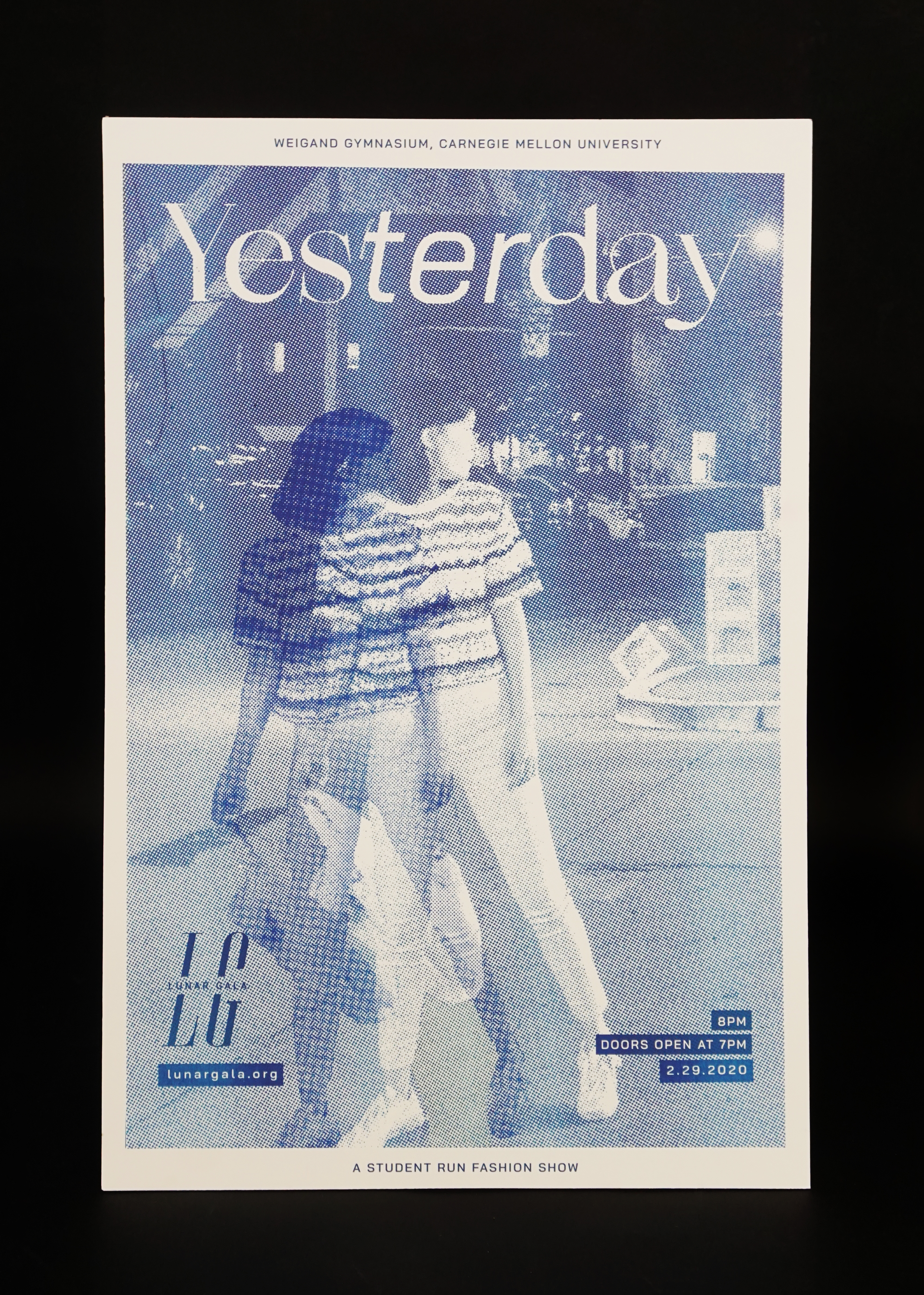
THESE POSTERS AND SOCIAL MEDIA ASSETS WERE WAYS FOR LG TO GET THE PITTSBURGH COMMUNITY TO BE CURIOUS AND INTERESTED IN WHAT’S TO COME IN THIS YEAR’S SHOW.
To advertise this year’s theme, we printed posters on both riso graph printers and laser printers. Luckily, we got access to the school’s one and only riso printer and did not need to outsource printing.
For the social media assets, we mirrored the qualities of the riso posters and the photography used within them. We made a banner for LG members to put on Facebook as their cover photos and made Instagram ads for the LG’s social media team to post on the organization’s account.

04. Day-of-Show
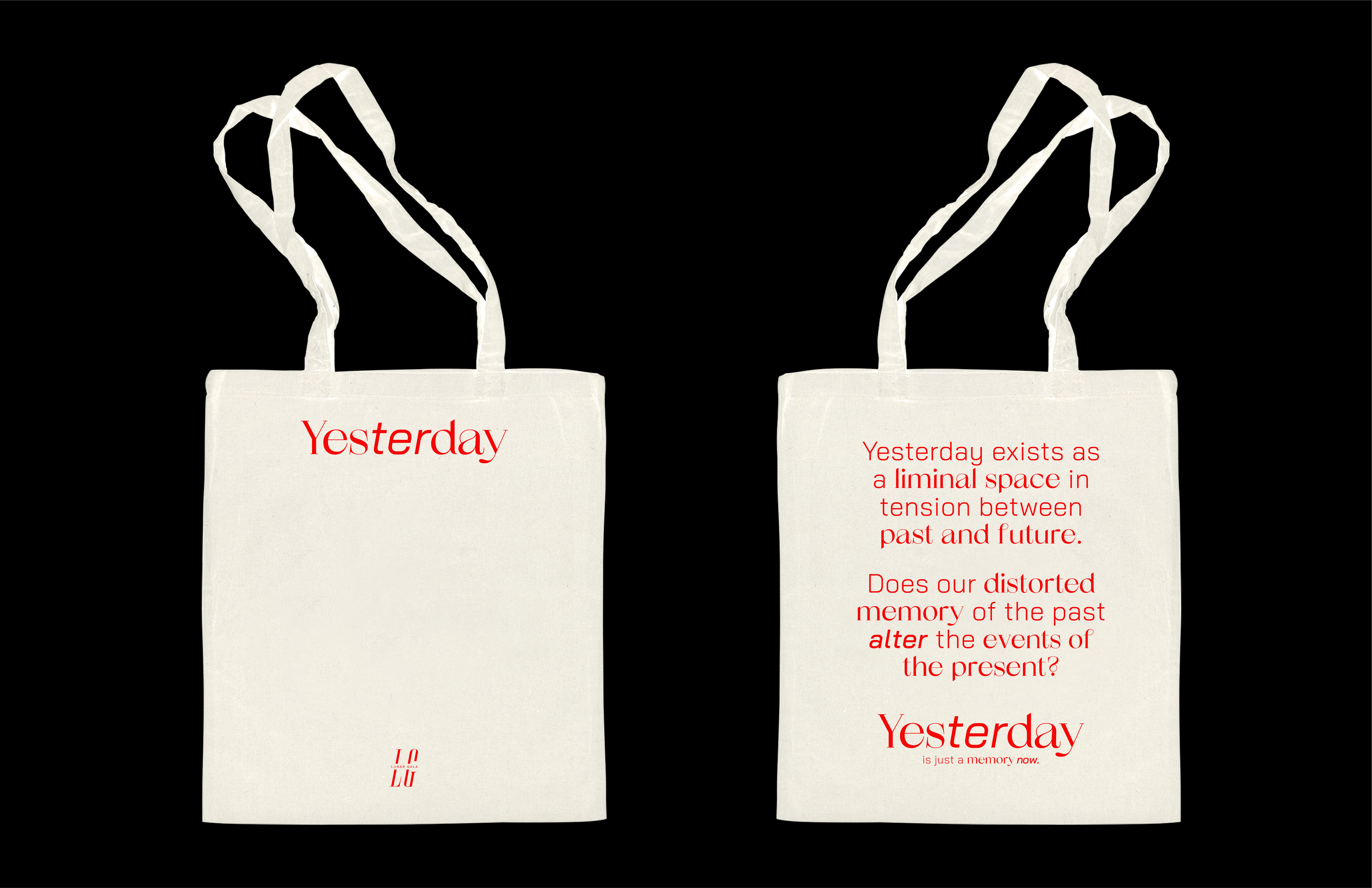
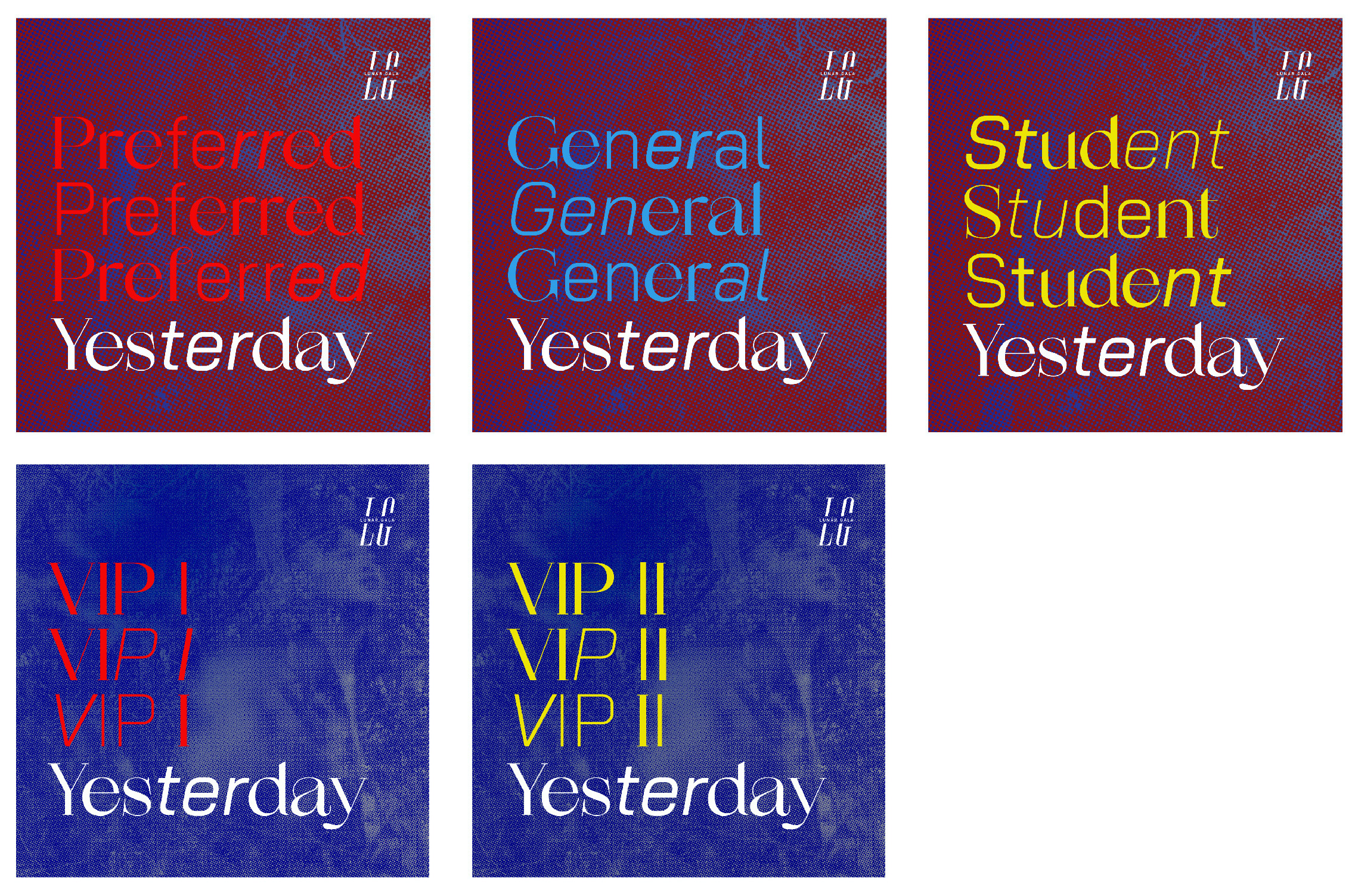
WHAT DOES THE MERCH LOOK LIKE? WHO GETS WHAT?
Following our visual system, I took advantage of type for the merch. The tan colored products were for attendees to purchase while the black t-shirt was for in-house members to wear at the end of the show. The tan long sleeve shirt and tote bag utilize the theme’s brief while the black short sleeve has a list of all the lines’ names that were showcased.
Inspired by museum entrance stickers, Jaclyn, the head of the Print team, suggested that I designed based on a sticker format, so I mirrored both the poster and website assets onto the stickers (i.e. poster background, website supplementary colors).


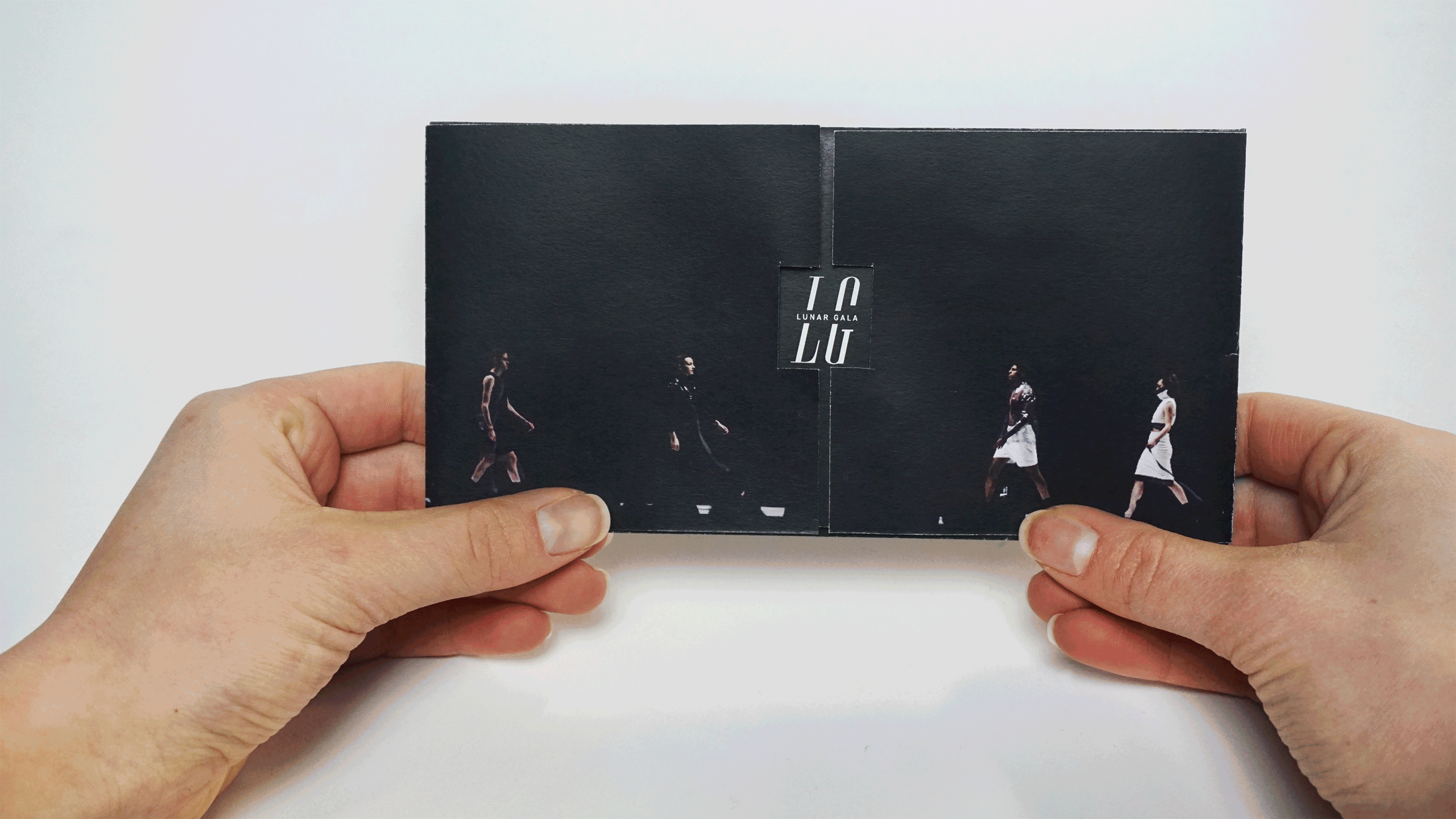
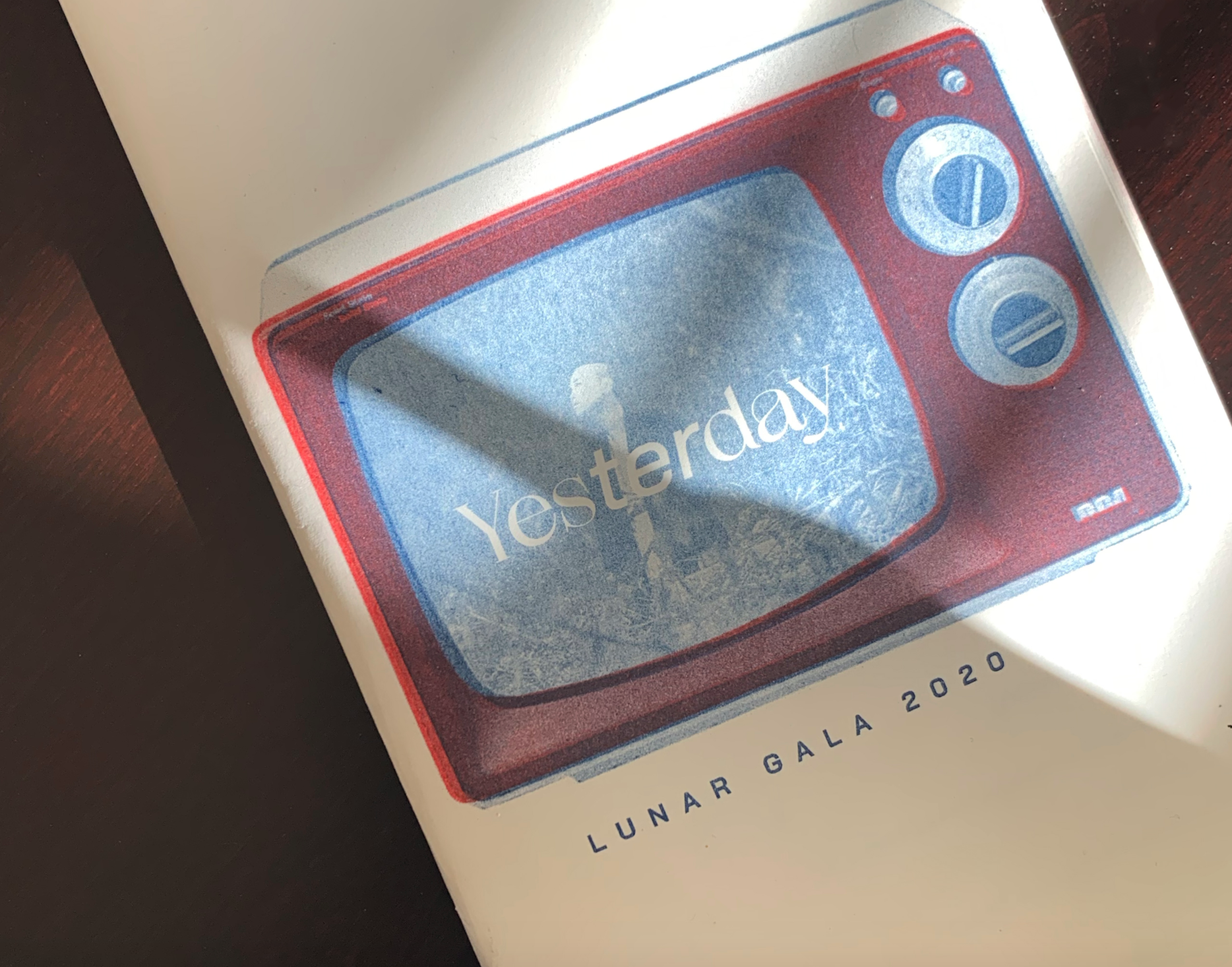
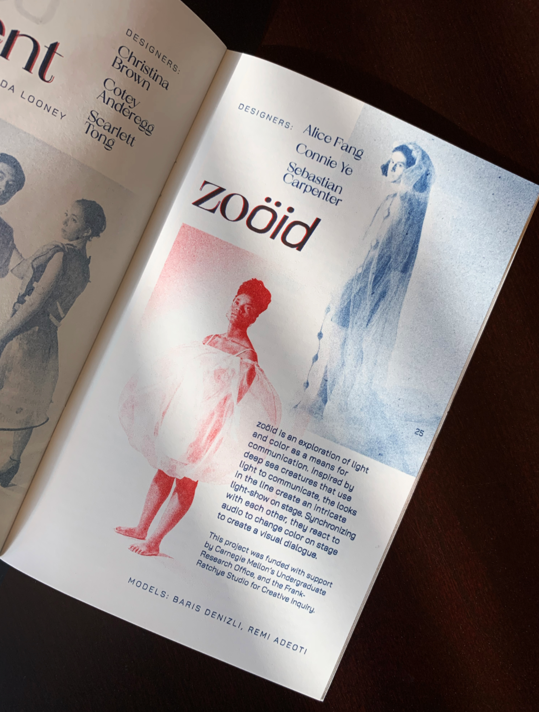
**I WAS NOT A PART OF THE BOOKLET TEAM, BUT HERE ARE SOME PICTURES OF THE FINALIZED OUTCOME!**
The 32-page show booklet was printed with Perfectly Acceptable Press in Chicago, IL. Risograph felt like the perfect treatment for the booklet and other print materials because of the weight and effect of the ink—it made the artifact special, as a token of memory for the event itself.
Photos from Alice Fang.
05. Reflection
✧ This is my first year joining the creative team, and I am so glad that I joined the Print team this year.
✧ With existing friendships with the members in the team, I believe that this allowed our bonds to grow stronger.
✧ I am excited to join the creative next year!! Maybe print or web team??